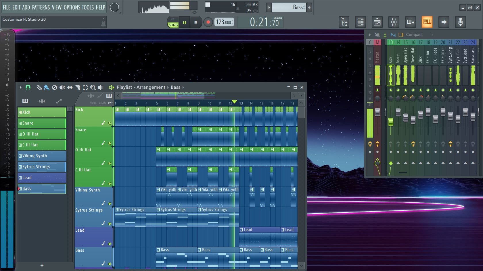
While skins are not available there are some things you can do to customize FL Studio 20. Not only can these changes be appealing to the eyes, but they are also a great way to stay organized and have a positive work flow. This includes the channel rack, mixer, and playlist as well as the toolbar at the top. We will start out with the easy stuff first.
BACKGROUND
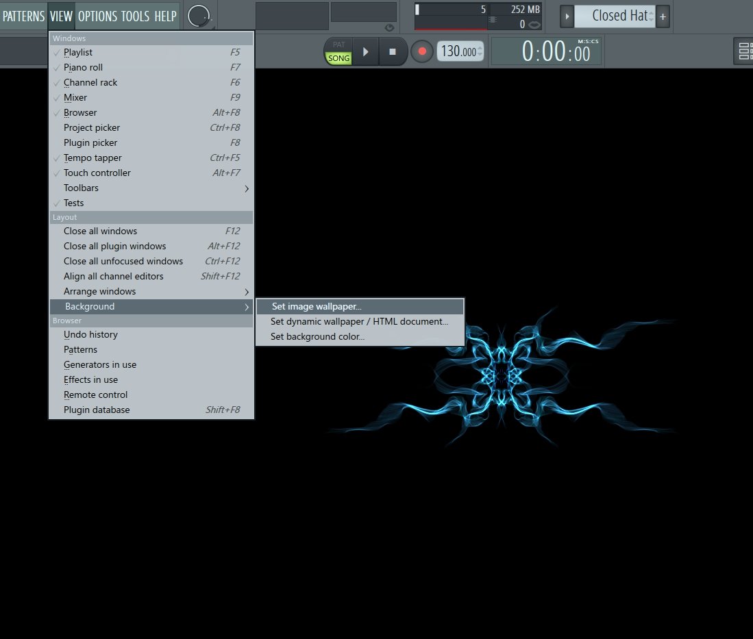
This is likely the easiest thing to do. Changing the wallpaper background. You can choose to upload your own image, choose a background color, or use an HTML document. Here is how you do it. From the menu in the upper left-hand corner click on “VIEW”, move down the list and click on “BACKGROUND."
CHANGE NAME
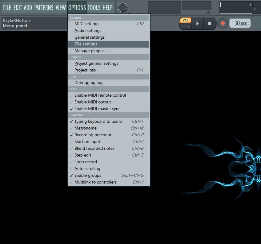
I have no shame here, but a lot of you hate that the registered name is what appears. When you register FL Studio you have to use your real name. There is no getting around it. Can you change it later? Nope. Logging into your Image-Line account shows no option to change this information. But there is a way to change it in FL Studio. You will have to change it for every session though. Here is how. From the menu in the upper left corner select “OPTIONS”, move down the list and select “FILE SETTINGS.”
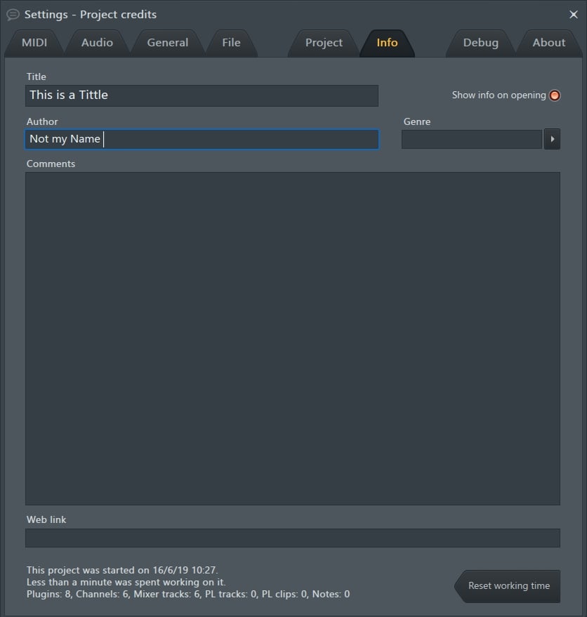
When the window opens up, select the “INFO” tab. Whatever it is that you want to type into the “TITTLE” field is what will then appear at the top.

MENU TOOLBAR
There is a lot you can do with the Menu bar at the very top of FL Studio. It really depends on what functions you rely on most. Here we have our good old standard Menu bar.

To begin, go to the menu in the upper left and select “VIEW.” Scroll down to “TOOLBARS” and click it so that the side menu appears. If you notice to the far right there are presets. For now, let's go ahead and select “EDIT.”
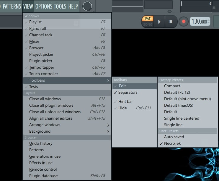
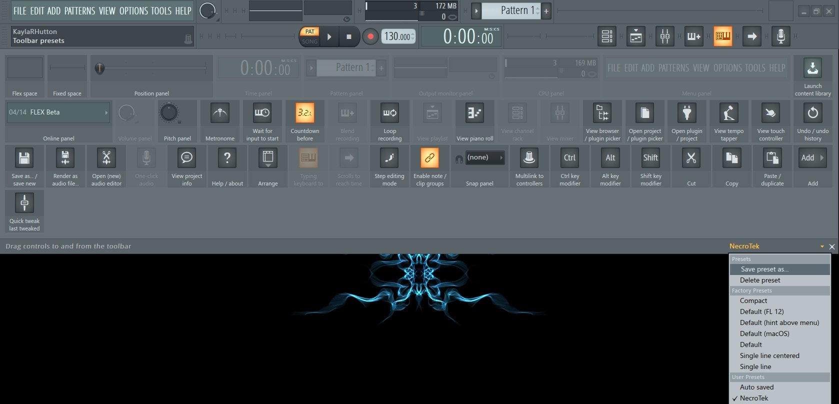
Now you will notice a lot of options have appeared.

To remove something, select it and return it to its place in the drop down option menu. To add something, drag it to the main toolbar. You can arrange them in any order. There is also a “FIXED” and “FLEX” spacer. You can insert those to create a gap between buttons. If you need it longer, just grab a side and pull it to the size you want. When you have it all set up go to the bottom right corner and select to “SAVE PRESET.” You can create as many as you like and name them for quick access.
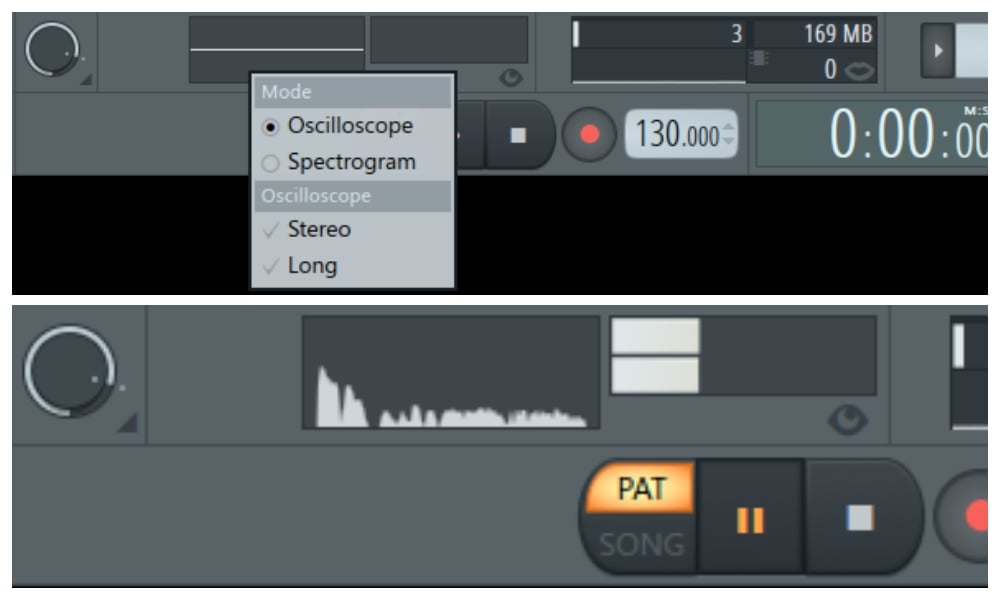
While we are at the toolbar, you also have the option to change the master meter. Just right click and you will see the following menu. This will allow you to view the waveform or leave it as it is with the Oscilloscope.
CHANNEL RACK
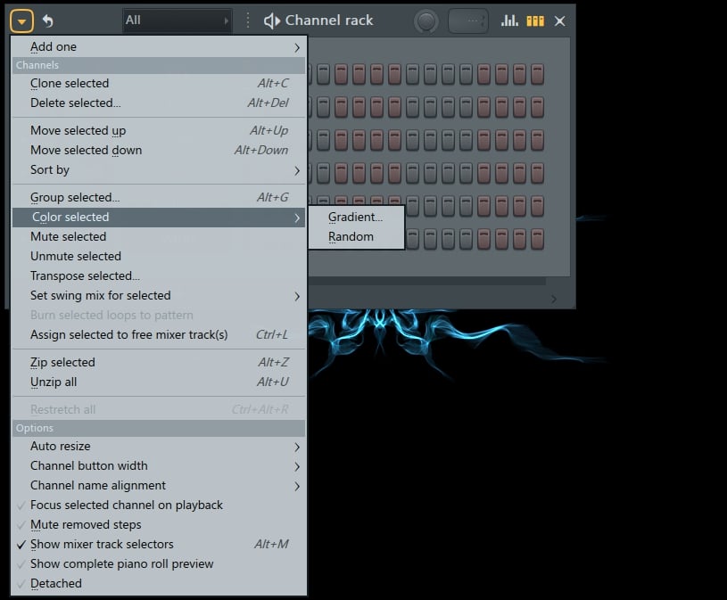
There are a couple of ways to go about this. From the channel rack you can right click on the sample and select rename, change color, or you can do it this way. From the channel rack in the upper left-hand corner select the channel options menu. When the list opens up you can scroll down “COLOR SELECTED.” You then have the “random” option or “gradient” option. The gradient option will allow you to pick 2 colors that will be the start and end of your color scheme.
MIXER
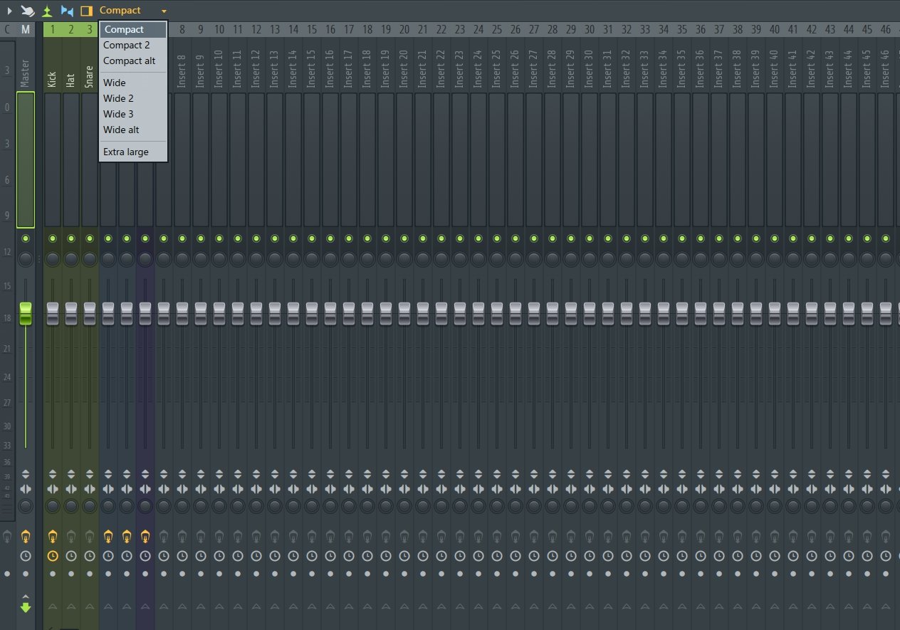
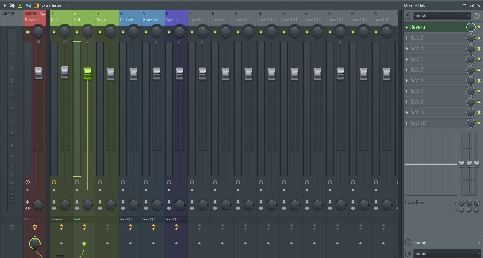
The mixer does come with 8 preset options. This will display more or fewer functions of the mixer. There is also an extra large option for those who like everything a little larger.
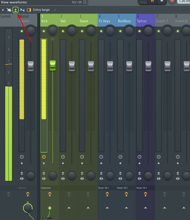
You can also choose to keep the standard meter look. Or with a click of a button, you can view the actual wave forms in the meters.
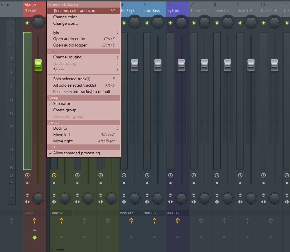
You can stay organized and make all of the inserts match the channel rack, or change them however you like. This does include the master. Here is how. Go to the top of the insert and right click. When the menu opens select “CHANGE COLOR.”
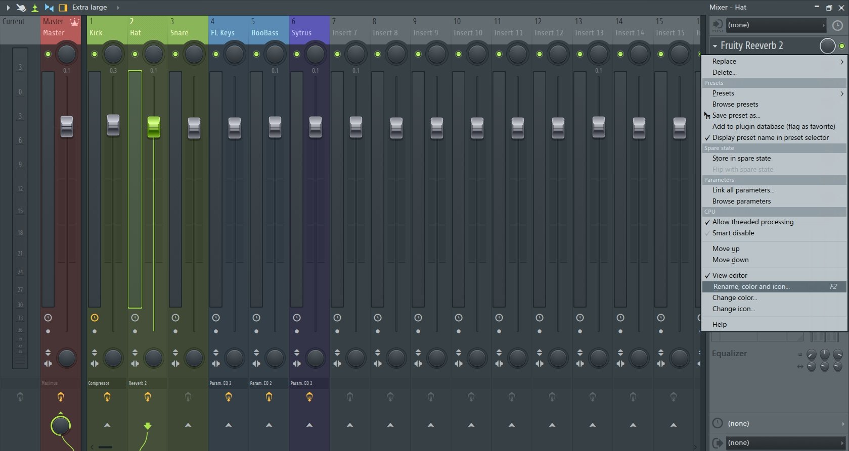
This also applies to the effects section. I think you know what to do, right? Right-click and when the menu opens up, select “RENAME, COLOR, ICON.”
PLAYLIST
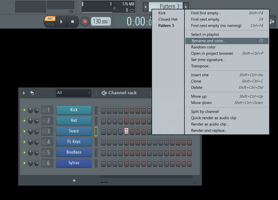
Next up, the playlist. This is another time for you to make things easy for yourself and keep an organized workflow. By keeping the same color scheme it makes placement and arrangement easy. Before we open the actual playlist, here is where you can start. Right click on the pattern selector. Each pattern can be customized by selecting “RENAME AND COLOR.”
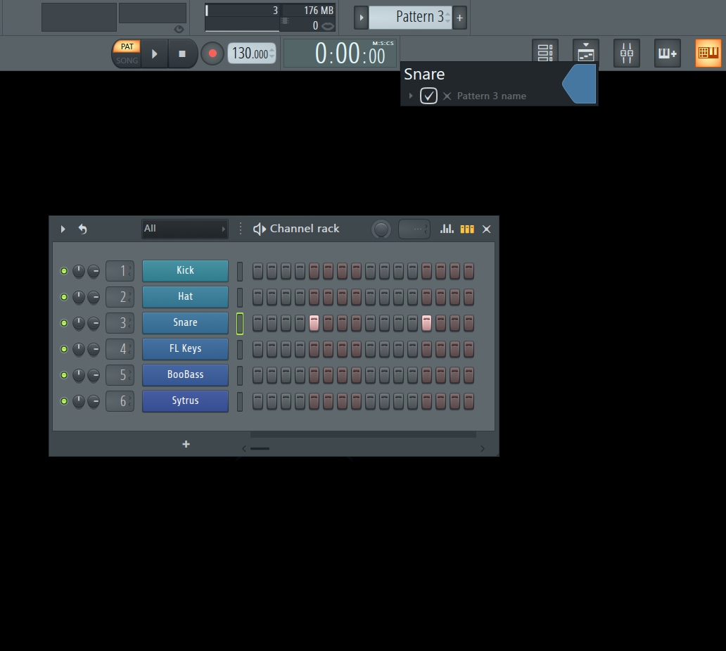
Now go ahead and open up the playlist. You will notice that my changes have been applied.
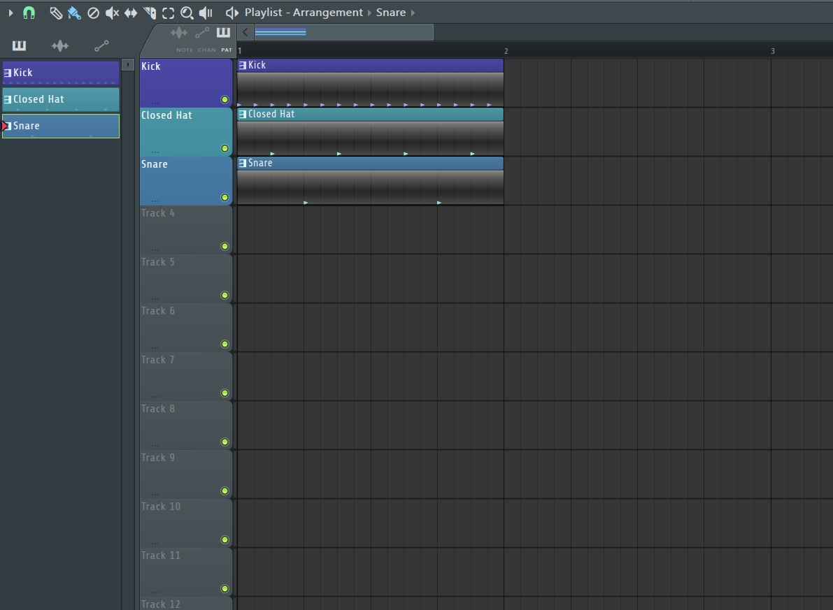
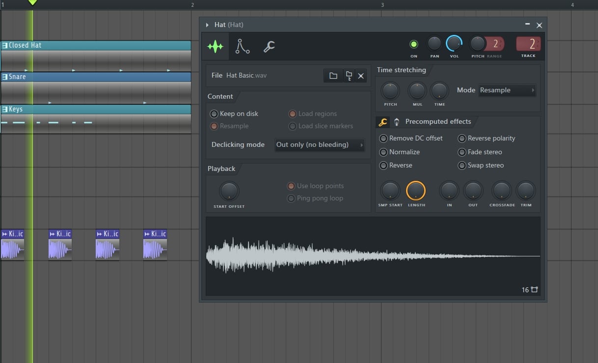
Next, if I take the sample and drag it into the playlist it is now an audio clip.
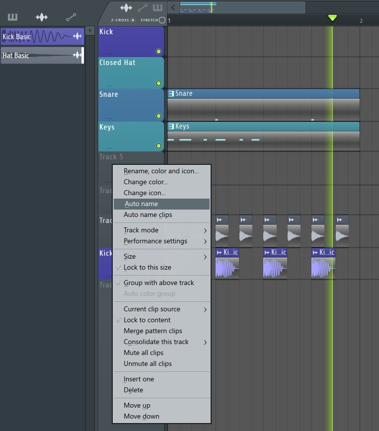
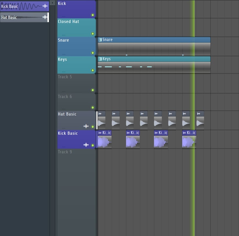
If I right click on the track I just dropped into the playlist, rather than change the color and rename it, I can select “AUTO NAME” and all my customization appears.
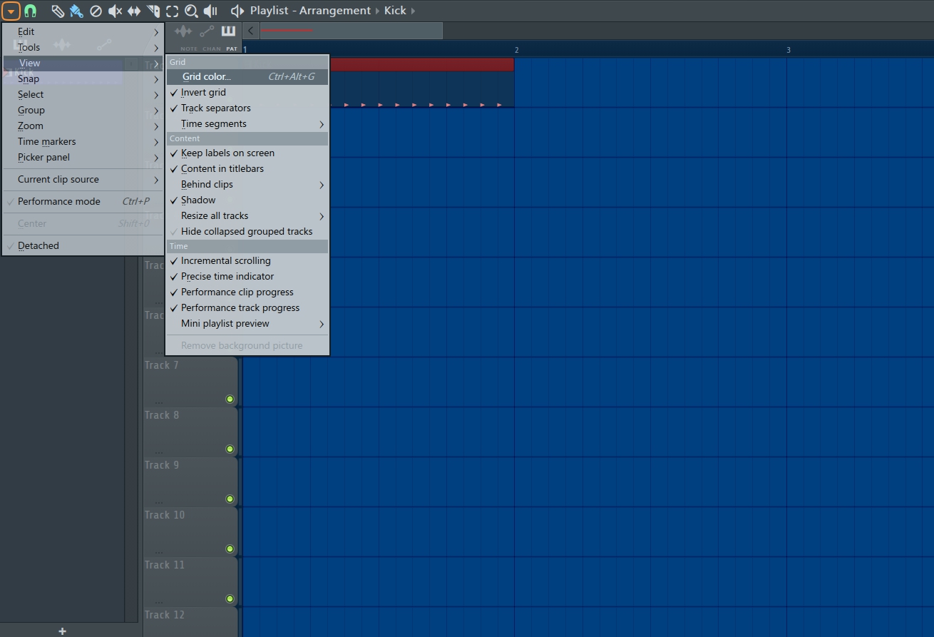
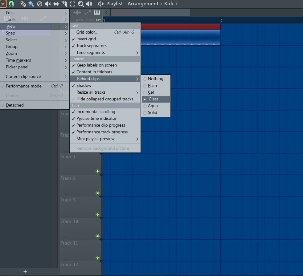
The last 2 changes involve the actual playlist itself. If you don’t like the standard FL Studio gray grid just go to the upper left-hand corner of the playlist and open the options. From there select “VIEW” and then “GRID COLOR.”
To match the wonderful grid color you selected you will more than likely not want any of your clips, samples, automation in gray. To change this go back to the upper left and open the options for the playlist. Select “VIEW” then “BEHIND CLIPS.” I went with the “GLASS” option, but as you can see you do have some options. I also turned on the “SHADOW” option to make it stand out from the grid.
And, now you have a customized and organized FL Studio 20. You don't need anyone to design skins. All you need is at your fingertips. Enjoy your custom designs and an organized positive work flow.











_Cropped.png?width=1600&name=02%20(2)_Cropped.png)


Your Comments :